MiVote
A human-centered website and content strategy for human-centered democracy.
Client
MiVote is a global direct democracy platform that allows people to vote based on policy, not party.
The Team
• Sienna Giraldi (Project Manager & Research Lead)
• Rodrigo Pesenti (Design Lead)
• Sean Breasley (Designer and Researcher)
Brief
Recommendations for a website redesign and content strategy to help grow its volunteer and voter base.
My Role
• Project Management
• Client Services & Stakeholder Management
• Research Design & Implementation
• Copywriting & Content Strategy
Outcome
A prototype that simplifies the user journey from discovery to sign up, and a content strategy that emotionally resonates with new visitors.
The Process
• Research
• Discovery
• Synthesis
• Design
The Research
Method
21 Stakeholder Interviews
8 Contextual Inquiries
11 Client Interviews
A Lot of Desktop Research
Objective
To understand the needs and mindsets of MiVote's target member and volunteer audience
To understand how users experience the website, and perceive MiVote after use
To identify the role of the website in MiVote's broader organizational goals and challenges
To identify category whitespace and best practice user engagement in the industry
Our hall of post-its, where we spent 3 weeks unearthing and synthesizing 400+ qualitative data points.
The Discoveries
Existing volunteers and members discovered, trusted, and came to love MiVote because of the people behind the organization.
“I used to find myself on the periphery of politics, but when I heard Adam [CEO] speak, I felt part of a community.”
“My cousin told me about MiVote, and I joined because I trusted and believed in its mission.”
Through stakeholder interviews, we found that one’s willingness to sign up as a member or volunteer depends on three key psychological factors:
1. Degree of self empowerment
2. Sense of social responsibility
3. Level of political engagement
However, new visitors of the MiVote website (regardless of these psychological factors) were both confused by the site and distrustful of the organization, showing that the website failed to capture MiVote’s credibility and explain its function.
Some demonstrative user quotes:
“I’m so confused.”
“I don’t understand what it is.”
“I don’t trust it in the slightest.”
“How could I trust it?”
Investigating the ways in which MiVote’s site failed new visitors, we found that the site’s complex organization of information caused premature drop off, with users leaving the site before fully understanding how MiVote worked let alone how they can get involved.
The existing site de-centralizes clarifying information and creates a rabbit hole of research for users.
As a result of a complex and de-centralized organization of information on the website, users found themselves on an unending pursuit for answers. The most common user journey is mapped below in blue, and shows the complexity and inefficiency of the site.
A complex user journey, led by a string of unanswered questions.
While it was key that the new design refine the user journey and streamline the delivery of information, it was also critical that our site spoke to users in ways that were unique within the category.
From an online review, we found that MiVote's competition spoke foremost as 'politicians' (using jargon and failing to demystify policies) rather than as 'people-centric communities.'
The whitespace for MiVote (which would define all copy and imagery on the site) was to lead from its humanity while distinguishing itself as an antidote to existing political systems.
Synthesis: Developing a Strategy for our Design
First, identifying our target audience.
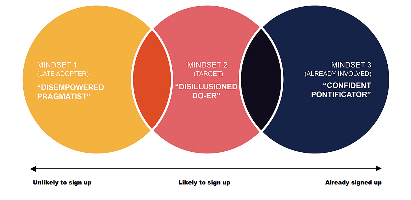
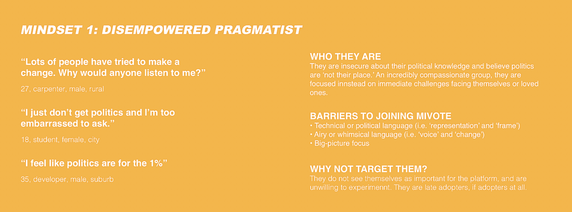
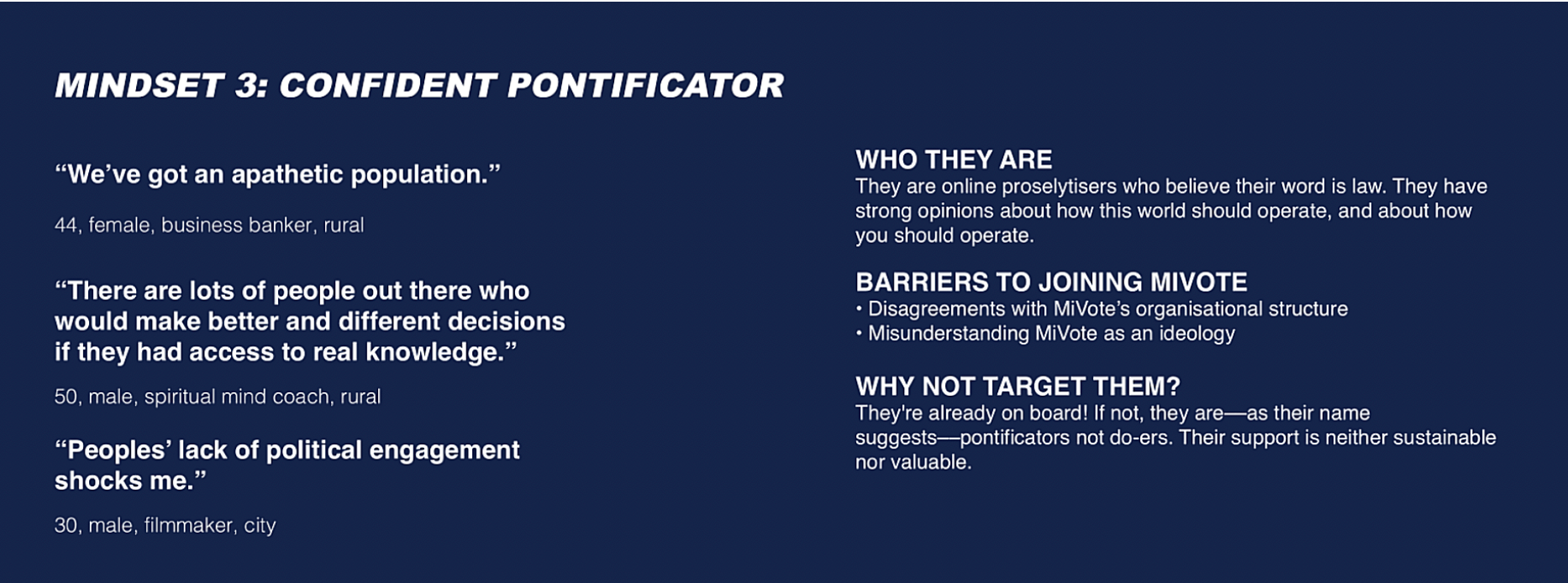
Based on our audience insights, we developed three audience 'mindsets' that allowed us to identify the website’s target audience––as well as its non-target audiences––and helped us better understand engagement strategies through which to define the website's content and design.
Second, setting guidelines for the prototype's content and structure.
We synthesized our findings into clear guidelines that helped us develop the website's content and design.
Content Guidelines
1. Offer MiVote as the first step toward understanding policy, lowering the barrier for engagement.
2. Provide clear and humanizing messaging, and showing the people behind the movement.
3. Communicate clear objectives, explaining what MiVote is, what it aims to do, and how newcomers can assist with that goal.
Design Guidelines
1. Prioritize informative content to ensure upfront clarification.
2. Simplify the user journey to ensure seamless information delivery and quick discovery of sign-up options.
3. Create seamless and linear discovery of content as to not overwhelm users with different page options.
Third, creating a revised site map and user journey.
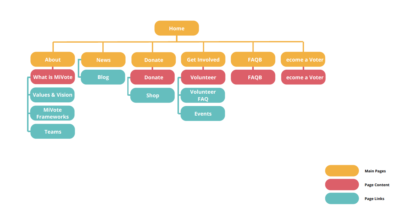
In order to resolve the issues of early drop off, limiting voter engagement and volunteer sign ups, our refined prototype simplified the organization of information on the site as well as the discovery to sign-up journey.
Revised and simplified site map.
Revised and simplified user flow.
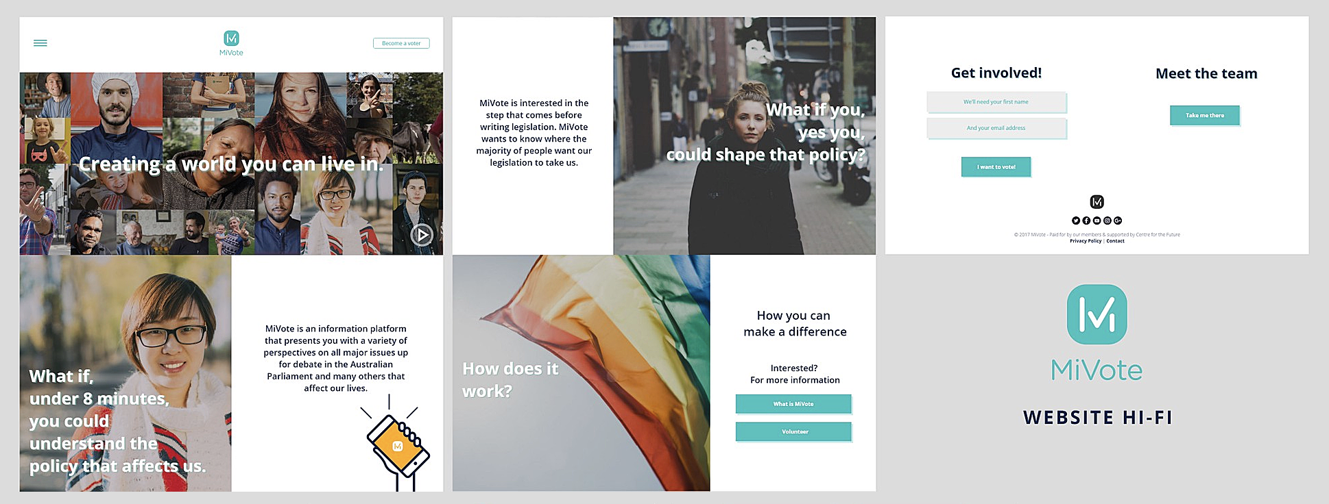
Design: Putting it all together in our hi-fi design.
Finally, we developed all content according to guidelines (human-centered copy and imagery) and developed a user journey that pre-empts user questions and provides immediate opportunities to become a voter and volunteer.
You can take a closer look at the prototypes here.


